TUTORIAL: DIFFERENT COLORS FOR DIFFERENT POST STATUSES IN YOUR WP DASHBOARD
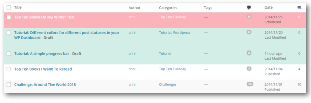
When looking at the overview of all my posts, I like to see right away what posts are published, drafts and scheduled. That’s why I changed the background and text colors in my dashboard. Red are my scheduled posts, green my drafts and published posts stayed the way the always look like.
In this tutorial I will show and explain a few lines of code so that you are able to choose your own colors for different post statuses.
WORDPRESS’ POST STATUSES:
Before we dive into changing the colors in your dashboard, you need to know what statuses you have and what they mean.
WordPress comes with 8 default statuses of which we are going to use 3:
- publish: these are posts that are published and can be viewed by everyone
- future: these are posts scheduled to be published at a later date.
- draft
If you want to change more than these three (e.g. trash) then have a look at this list.
CSS:
When displaying the posts, WordPress assigns each row in the table a certain class according to the post’s status. The classes you are going to need are the following three:
As you can see, it’s always “.status-STATUS”.
Now you want to change the background color and also the link/text color because the default one doesn’t look well on every background:
For this to work, it’s necessary to include the “!important” declaration at the end of each rule. This way your rules instead of the ones defined in WP’s stylesheet are used. You need a second rule to change the text color because it’s a link and changing the text color in the first one won’t make a difference.
WHERE TO PUT THESE CSS RULES:
Once you’ve declared your CSS rules the only question left is where to put them. You shouldn’t put them into WP’s own stylesheet because then you would have to add your rules again everytime you update WP.
Styles don’t need to be written in external stylesheets though, but can also be included in the head or footer of an html file. WP provides a function that let’s you add things to this head or footer. These functions need to be used in your functions.php, that is inside your theme folder. If you don’t have that file yet, just create one.
Now we need to call the function to write into the footer and use our rules:
add_action: this will run the function ‘posts_status_color’ when the event “admin_footer” occurs.
posts_status_color: This is our own little function that includes your style.
This code snippet needs to be part of your functions.php. Just add it in the last line before the closing php tag “?>” so that it looks like this:
Now go to your Dashboard to see the changes you made! If something is not working the way you want, just tell me, I’ll help you out.
Feel free to ask questions in the comments.
I like planning blog posts ahead, especially with reviews of upcoming books or events like Sci-Fi November. I still write a list of blog posts of the upcoming month on paper, just so I know what I still need to do, but I also wanted an overview in an actual calendar. For some time I used google’s calendar mainly because I could categorize my blog posts by using different colors. I didn’t really like to use something somewhere else than my dashboard where I actually scheduled my blog posts though. Then I had the idea to use a Calendar plugin for my scheduled posts and assign colors via categories myself.
THE PLUGIN
The plugin I use is the Editorial Calendar. It adds another menu item in your Posts menu where you’ll get a calendar view of all your blog posts. And the best thing about it: you can move blog posts easily via drag and drop, you can manage your drafts and add new ones and quick edit every blog post.
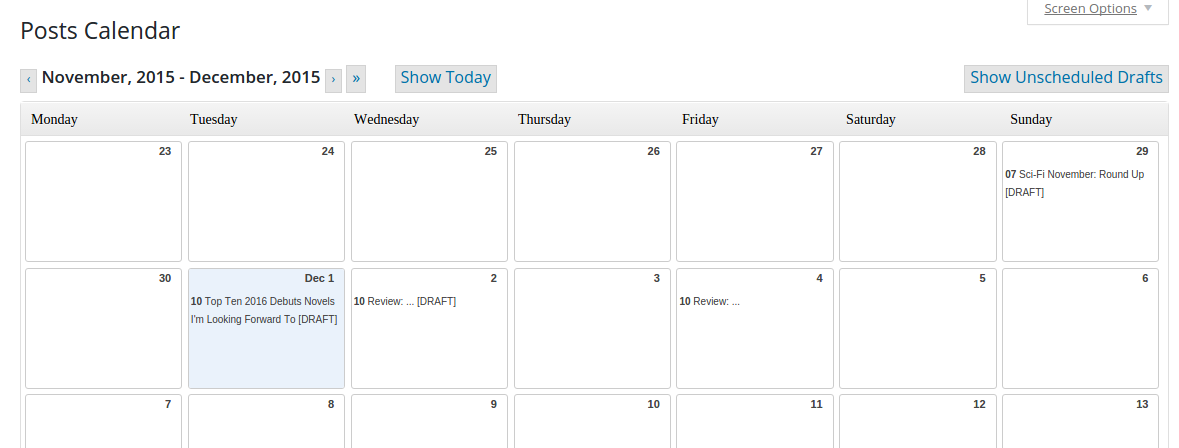
I always loved using this calendar. It gives you such a nice overview to spread your blog posts equally and it’s so easy to manage your blog posts. The above picture shows how the calendar usually looks like and for me it was lacking different colors. So I added a little code snippet to add colors to different post statuses and also to the different categories of my posts.
ADDING COLORS
ADDING THE CODE SNIPPET
All we need is a few CSS rules to add the colors. This can be done with a small code snippet added to your functions.php in your theme folder at /wp-content/themes/THEME_NAME/functions.php. (Another option would be to add it to a/your blog’s own plugin so you don’t loose it/have to copy it when you change your theme)
Now all you have to do is add the different styles for different statuses or categories.
WHAT CLASSES TO USE FOR THE CSS RULES
First of you should use the class “dayobj” (which is the box for each day) because the classes of the individual posts aren’t that unique and you might just change something else as well.
The classes for different statuses:
- future (=scheduled)
- draft
- publish
The classes for categories are just the slugs, meaning a category “Review” has the class “review” and the category “Top Ten Tuesday” has the class “top-ten-tuesday”.
Now you can either use the class of just the status or the category or you can combine them. Here are a few examples:
Now there is something that you should add too. The predefined background color is a light grey which also shows up when you hover over a blog post. Of course we would rather have our own color there too, so you also have to add a rule for the class “.postlink:hover”. Depending on what background color you use, you might also want to change the link color. A rule for a future review would look like this then:
So now I have a bunch of different colors for my scheduled posts (and drafts are black for motivation, so that I want to get rid of that boring color :P)

This tutorial is about how you can customize unordered html lists, with different symbols and even your own icons.
THE UNORDERED LIST:
I already assigned a class to the list with which I’m going to work from now on.
Different pre-defined symbols:
There are already a few symbols you can use for your list: disc, circle, square, none. These are defined via the list-style-type. For example:
Use any other symbol:
Instead of using one of the 3 given symbols you can also use any other html symbol. To define those you need to do a bit more though than just define the list-style-type. First you have to define this type as “none” and then you have to add your chosen symbol as content before each list item element:
If you want to use special characters, like the ones in the picture on the top, you can’t just type/copy the symbol, but have to use it’s numeric representation which you can look up here. The example with the diamond would be like this:
When you do it just like that and you have multiple lines for one list element, your text won’t be indented but will start right under the symbol. If you want all lines of text to start at the same position, add the following:
You have to play around with that value a bit so that it fits the width of the symbol.
Make that symbol a different color than the text
For this to work, just add a color to the content you added before the list item:
Use an image as a symbol:
Instead of working with the list-style-type, you can also work with the list-style-image. Just enter the URL of the image like this:
Alternating symbols:
I guess no one will actually want to use this, so I’m showing this just for fun. You can access every list item by their number and also check if their number is even or odd. Using this you could have alternating symbols like in the picture at the top:
Feel free to ask questions in the comments.
For more Code & Design Tutorials see this
Last year, when I created my page for updates about challenges I wanted to add something that visualizes my current progress. I wanted more than just lists and added a progress bar for each challenge as you can seehere.
These progress bars are actually pretty easy and just need a few lines of html and css which will be explained in this tutorial.
THE HTML:
All you need is two div, one inside the other. The one with the id “goal” is the outer box and the one with the id “progress” is going to be the inner one. Now we only need to assign styles that make them look like a progress bar.
THE CSS:
First we have the rules for the outer box. We need a fixed width and height. You can choose any value you want. We also need a background color. If you want your progress bar to be centered, you also have to add the margin.
The inner box gets the same height as the outer box. The width should show your progress, so you’re just going to use the percentage. Assign a different background color and you’re ready.
You don’t want to write these rules into an external stylesheet though because you want to change the width all the time. That’s why you should use the style attribute and write the rules directly into your html = your post/page like this:
If you liked this tutorial and use wp.org you should definitely come back for the next one, as I will show you how to add these progress bars even more easily and with less code.
Feel free to ask questions in the comments.
Comments
Post a Comment